Nine Patch Dash
I've hit an interesting little snag in my quilt making, where the style of quilts I've become deeply inspired by don't really fit my natural work flow. Does this ever happen to you? There are a few areas in my life where I am a stickler for detail. I love making a corner or shelf in my house tidy and beautiful. I arrange picture frames just so. But the way I make quilts is with a pile of cut fabric next to my machine, which I then churn everything through in one sitting, then press, then church, press, churn, until I have a quilt top. No design wall, no coloured grid, not too much of a plan, just a kind of idea. That's how I find my zone. It's the way I find easiest to stay motivated, and work in small chunks if I need to.

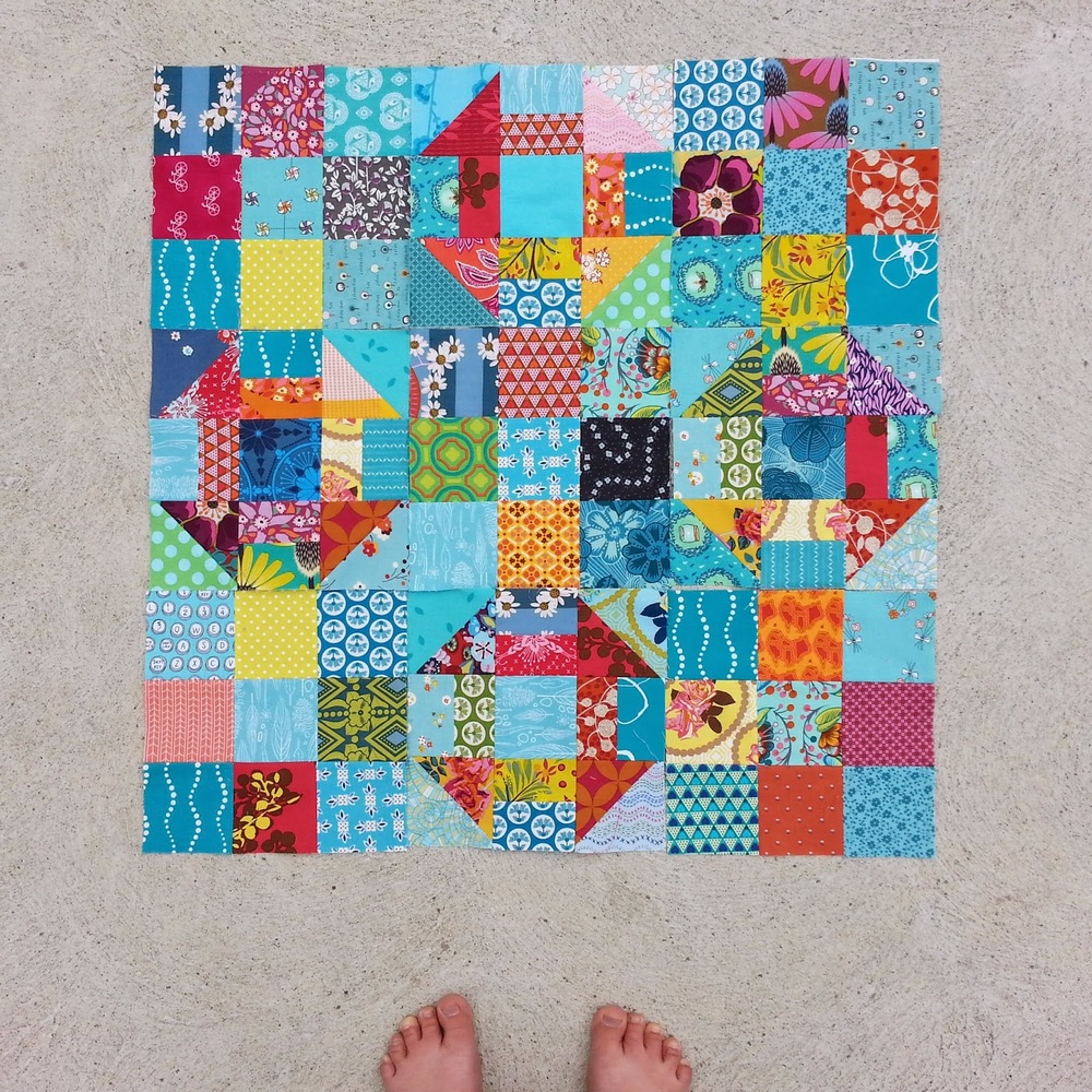
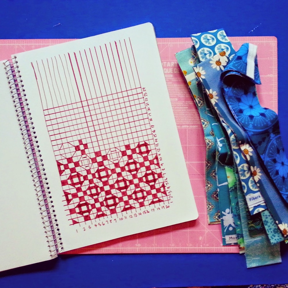
But lately I've become more and more taken with traditional blocks, especially those that make secondary patterns once put together. After stealing many small moments on Pinterest and Googling images, I was inspired by this one for my next Graduation Quilt, but I was intrigued to see if I could make it scrappy, with a focus on Anna Maria Horner Prints, because I knew my recipient liked them. I played around with a grid and some markers, trying a few different variations before settling on the original, with aqua basics in the negative space. I wanted something more saturated than you can get with white or low volume prints, and more vibrant than grey.

As you can see, the quilt won't end up with the same clear pattern as it does on paper. It does have a shimmery, colourful sea kind of feel that's helping me to keep going, but it's definitely been one of those learning experiences where I spend much of my time thinking, "Oh, if I'd done it this way..." or "I think next time I'll use that colour instead." Add to that the fact that I'm laying out each block before I sew it together rather than picking out random squares next to my machine, and it makes for a whole lot more thinking than I tend to find relaxing! Such is the way with experiments. While it's less fun than complete confidence, there is a kind of satisfaction in growth.
So with my turn coming up as designer for do. Good Stitches' Care Circle, I thought I'd let my bee mates put the work into the complete opposite interpretation of this design, so we can compare the results. I thought I'd share the tutorial here in case anyone else wants to contribute to the experiment? I've been labelling relevant pictures on Instagram with the hashtag #9patchdash if you decide to make one!
I've made my blocks from a 3.5" base, which makes a 9.5" unfinished block.
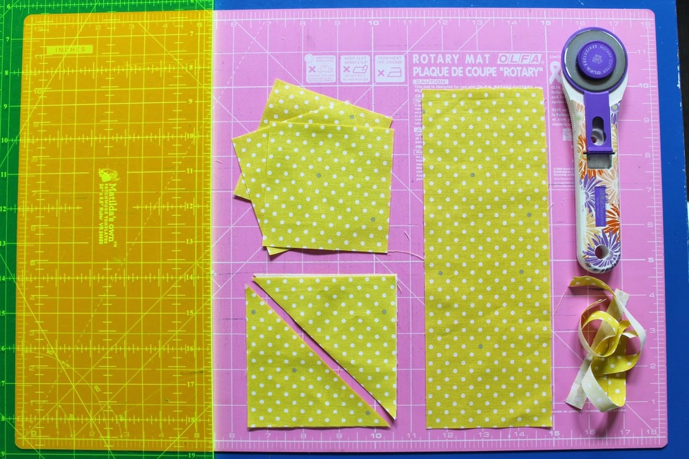
 To make the two-colour cross version, cut one strip of each colour 4" wide, by width of fabric.
 From each strip, first cut two 4" squares. My preference for sewing half-square triangles is to cut these in half diagonally, and then sew and trim to 3.5".
(If you are making the traditional churn dash block, you can now cut two pieces from each colour that are 4"x3.5" wide. Cut these in half to get four 2"x 3.5" rectangles in each colour. Sew the different colours together to make four 3.5" squares.)
From the remaining strip, cut:
- One coloured 9.5" x 3.5" rectangle
- Three coloured 3.5" squares
- Eight white 3.5" squares.
(for the alternative block layout, you'll need instead, 6 white squares and 4 coloured squares)
I sewed mine together in strips of three squares and then sewed those lines together into the blocks. And, I found it so enjoyable that I made two lots. So maybe it's the constant learning, arranging, thinking and reassessing that slows me down, and not the old nine patch afterall?
 I'm asking the Care Circle girls to make one block (or more if you'd like!) of each in really plain mustard/yellow. I've put some other basics in the picture above so if have those, you can use them, or refer to the colours as a guide. I think it would look great with solids too! I'm looking forward to seeing this contrast between this sunny/flat look and the other rich, turbulent one. Which is more your style?


